Graph Reader Pro 5.0Graph Reader Pro 5.0 for TradingView gives you abilities to see the stories hiding in the graphs of the stock, forex, and crypto currency markets. It counts CC59 and creates respectable support and resistance levels as well as marks and reminds you about important parameters that are happening in the graph so that you will not forget to consider them before placing orders. These parameters include:
Automatic CC59 counting that compares the close of the right price bar to that of left price bar in a group of 5 consecutive bars (ignoring 3 bars in the middle). If the right bar closed higher, the count positive number would be printed above the bar. If the right bar closed lower, the count negative number would be printed below the bar. Nine consecutive series of up counts will define the lowest price as CC59 support line and nine consecutive series of down counts will define the highest price as CC59 resistance line. The counted numbers, support and resistance lines are automatically printed on the graph if enabled.
Draw the high and low levels of the previous day, if enabled. The Previous Day's High and Low are often used as reversal levels in the few future days.
Draw the price range of each day based on Average Daily Range (ADR) value. These lines only show in graphs with less than daily time frames.
Draw the price range of each week based on Average Weekly Range (AWR) value. These lines only show in daily graphs.
Draw simple moving average line SMA3 (yellow), SMA13 (green), SMA50 (pink), and SMA200 (white).
Draw Bollinger bands (50,2) upper and lower lines (pink) with SMA50 as a center line (pink).
Locate the price gaps in the graphs of stocks and indexes. The opened gaps are often closed later on. Hence, they are milestones for the price to come back and close them up.
Paint the background areas with active Forex trading of Asian, London, and New York sessions, if enabled.
Locate an engulfing bar that cover the previous bar with a body portion less than 50% of its range.
Locate an anchor bar that has the range (High - Low) larger than those 14 bars earlier.
Print "RSI>70" and "RSI<70" for RSI(14) that crossed above 70 % and below 70 %.
Print "RSI<30" and "RSI>30" for RSI(14) that crossed below 30 % and above 30 %.
Print "MACD>Sig" and "MACD0" and "MACD<0" for MACD(12,26,9) that crossed above and below zero.
Print "Max" and "Min" for local maximum and local minimum bars.
Print "MA3>13>50" and "MA3<13<50" for ordering of SMA(3,13,50).
Create alarm conditions for the following events that could be set to notify the investor on screen, to an email and to a smart phone:
"Close above MA3"
"Close under MA3"
"Close above MA13"
"Close under MA13"
"Close above MA50"
"Close under MA50"
"Close above MA200"
"Close under MA200"
"MACD up"
"MACD down"
"MACD>Sig"
"MACD0"
"MACD<0"
"MA3 up"
"MA3 down"
"MA13 up"
"MA13 down"
"MA50 up"
"MA50 down"
"CC59 = -1"
"CC59 = +1"
"CC59 = -9"
"CC59 = +9"
"CC59 = -9F"
"CC59 = +9F"
"MA3 < MA13"
"MA3 > MA13"
"MA13 < MA50"
"MA13 > MA50"
"(MA3 < MA13) > MA50"
"MA50 > (MA3 > MA13)"
"MA3 > MA13 > MA50"
"MA3 < MA13 < MA50"
"RSI<30"
"RSI>30"
"RSI<50"
"RSI>50"
"RSI<70"
"RSI>70"
"Hit yesterday's high"
"Hit yesterday's low"
"Hit day open + ADR/2"
"Hit day open"
"Hit day open - ADR/2"
"Hit CC59 resistance"
"Hit CC59 support"
=================================================================================================
The source code of Graph Reader Pro 5.0 custom indicator is protected.
Only invited TradingView members can apply this indicator to their forex, crypto currency and stock price graphs.
Lifetime invitation is for 100 USD with free future upgrades and online supports.
Rental invitation is for 10 USD/month with free future upgrades and online supports.
Paypal, Bank transfer and Bitcoin payments are welcome.
For more informaton please contact the author (DrGraph or Nimit Chomnawang, PhD) via TradingView private chat
or in the comment field below.
=================================================================================================
How to install the script:
------------------------------
*Go to the bottom of this page and click on "Add to Favorite Scripts".
*Remove older version Graph Reader Pro by clicking on the "X" botton behind the indicator line at the top left corner of the chart window.
*Open a new chart at and click on the "Indicators" tab.
*Click on the "Favorites" tab and choose "Graph Reader Pro 5.0".
*Right click anywhere on the graph, choose "Settings".
*In "Style" tab, choose the Dark Theme.
*In "Scales" tab, select Decimal Places = 1/100000.
*In "Background" tab, uncheck "Indicator Arguments" and "Indicator Values".
*In "Timezone/Sessions" tab, choose Time Zone = Your local time.
*At the bottom of settings window, click on "Template", "Save As...", then name this theme of graph setting for future call up such as "Graph Reader Pro".
*Click OK.
*Right click anywhere on the graph, choose "Color Theme => Dark".
For free TradingView plan, you can add two more indicators to the chart. That means you may add RSI and MACD indicators with same parameters as those setup in Graph Reader Pro to your graph. DrGraph regularly publishes his educational ideas on using features provided in Graph Reader Pro for profitable investments. You can follow him for how to use the tools in trading stocks, forex, and binary options.
在腳本中搜尋"the script"

Graph Reader Pro 4.0Graph Reader Pro 4.0 for TradingView gives you abilities to see the stories hiding in the graphs of the stock, forex, and crypto currency markets. It counts CC59 and creates respectable support and resistance levels as well as marks and reminds you about important parameters that are happening in the graph so that you will not forget to consider them before placing orders. These parameters include:
Automatic CC59 counting that compares the close of the right price bar to that of left price bar in a group of 5 consecutive bars (ignoring 3 bars in the middle). If the right bar closed higher, the count positive number would be printed above the bar. If the right bar closed lower, the count negative number would be printed below the bar. Nine consecutive series of up counts will define the lowest price as CC59 support line and nine consecutive series of down counts will define the highest price as CC59 resistance line. The counted numbers, support and resistance lines are automatically printed on the graph if enabled.
Draw the high and low levels of the previous day, if enabled. The Previous Day's High and Low are often used as reversal levels in the few future days.
Draw the price range of each day based on Average Daily Range (ADR) value. These lines only show in graphs with less than daily time frames.
Draw the price range of each week based on Average Weekly Range (AWR) value. These lines only show in daily graphs.
Draw simple moving average line SMA3, with ability to change the line color based on increasing or decreasing MACD value.
Draw simple moving average line SMA50, with ability to change the line color based on its own increasing or decreasing value.
Locate the price gaps in the graphs of stocks and indexes. The opened gaps are often closed later on. Hence, they are milestones for the price to come back and close them up.
Draw a ribbon of simple moving average lines consisting of SMA3, SMA4, SMA5, SMA6 and SMA7, if enabled. Twisting of the SMA ribbon gives a visual signal for price reversal.
Draw a set of other simple moving average lines such as SMA13, SMA200, SMA800 (if enabled).
Paint the background areas with active Forex trading of Asian, London, and New York sessions, if enabled.
Locate an engulfing bar that cover the previous bar with a body portion less than 50% of its range.
Locate an anchor bar that has the range (High - Low) larger than those 14 bars earlier.
Print "RSI>70" and "RSI<70" for RSI(14) that crossed above 70 % and below 70 %.
Print "RSI<30" and "RSI>30" for RSI(14) that crossed below 30 % and above 30 %.
Print "RSI<50" and "RSI>50" for RSI(14) that crossed below 50 % and above 50 %.
Print "MACD>Sig" and "MACD0" and "MACD<0" for MACD(12,26,9) that crossed above and below zero.
Print "Max" and "Min" for local maximum and local minimum bars.
Print "SMA5>13" and "SMA5<13" for SMA(5) crossed above and below SMA(13).
Print "Highest" and "Lowest" at the highest and lowest prices in a group of configurable number of bars earlier.
=================================================================================================
The source code of Graph Reader Pro 4.0 custom indicator is protected.
Only invited TradingView members can apply this indicator to their forex, crypto currency and stock price graphs.
Lifetime invitation is for 100 USD with free future upgrades and online supports.
Rental invitation is for 10 USD/month with free future upgrades and online supports.
Paypal, Bank transfer and Bitcoin payments are welcome.
For more informaton please contact the author (DrGraph or Nimit Chomnawang, PhD) via TradingView private chat
or in the comment field below.
=================================================================================================
How to install the script:
------------------------------
*Go to the bottom of this page and click on "Add to Favorite Scripts".
*Remove older version Graph Reader Pro by clicking on the "X" botton behind the indicator line at the top left corner of the chart window.
*Open a new chart at and click on the "Indicators" tab.
*Click on the "Favorites" tab and choose "Graph Reader Pro 4.0".
*Right click anywhere on the graph, choose "Settings".
*In "Style" tab, choose the Dark Theme.
*In "Scales" tab, select Decimal Places = 1/100000.
*In "Background" tab, uncheck "Indicator Arguments" and "Indicator Values".
*In "Timezone/Sessions" tab, choose Time Zone = Your local time.
*At the bottom of settings window, click on "Template", "Save As...", then name this theme of graph setting for future call up such as "Graph Reader Pro".
*Click OK.
For free TradingView plan, you can add two more indicators to the chart. That means you may add RSI and MACD indicators with same parameters as those setup in Graph Reader Pro to your graph. DrGraph regularly publishes his educational ideas on using features provided in Graph Reader Pro for profitable investments. You can follow him for how to use the tools in trading stocks, forex, and binary options.

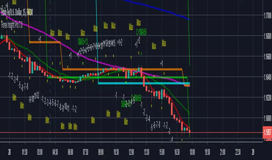
Graph Reader Pro 3.0Graph Reader Pro 3.0 for TradingView gives you abilities to see the stories hiding in the graphs of the stock, forex, and crypto currency markets. It counts CC59 and creates respectable support and resistance levels as well as marks and reminds you about important parameters that are happening in the graph so that you will not forget to consider them before placing orders. These parameters include:
Automatic CC59 counting that compares the close of the right price bar to that of left price bar in a group of 5 consecutive bars (ignoring 3 bars in the middle). If the right bar closed higher, the count positive number would be printed above the bar. If the right bar closed lower, the count negative number would be printed below the bar. Nine consecutive series of up counts will define the lowest price as CC59 support line and nine consecutive series of down counts will define the highest price as CC59 resistance line. The counted numbers, support and resistance lines are automatically printed on the graph if enabled.
Draw the high and low levels of the previous day, if enabled. The Previous Day's High and Low are often used as reversal levels in the few future days.
Draw the price range of each day based on Average Daily Range (ADR) value.
Draw the price range of each week based on Average Weekly Range (AWR) value.
Paint the background areas with active Forex trading of Asian, London, and New York sessions, if enabled.
Draw simple moving average lines such as SMA3, with ability to change the line color based on increasing or decreasing MACD value.
Draw simple moving average lines such as SMA50 with ability to change the line color based on increasing or decreasing prices. A set of other simple moving average lines such as SMA13, SMA200, SMA800 can be drawn if enabled.
Draw a ribbon of simple moving average lines consisting of SMA3, SMA4, SMA5, SMA6 and SMA7, if enabled. Twisting of the SMA ribbon gives a visual signal for price reversal.
Locate the price gaps in the graphs of stocks and indexes. The opened gaps are often closed later on. Hence, they are milestones for the price to come back and close them up.
Locate the pin bars having the body portion less than a specific percent of the range. The pin bars show hestitation for the price to continue the current trend. When a pin bar is covered or engulfed by the next larger bar, a trend reversal offen follows.
Automatic printing of the events happening in the graph to remind the readers of parameters under considerations (if enabled) including:
- Print "C>SMA3" and "C13" and "SMA5<13" for SMA(5) crossed above and below SMA(13).
- Print "Max" and "Min" for local maximum and local minimum bars.
- Print "RSI>70" and "RSI<70" for RSI(14) that crossed above 70 % and below 70 %.
- Print "RSI<30" and "RSI>30" for RSI(14) that crossed below 30 % and above 30 %.
- Print "RSI>50" and "RSI<50" for RSI(14) that crossed above 50 % and below 50 %.
- Print "RSI<50" and "RSI>50" for RSI(14) that crossed below 50 % and above 50 %.
- Print "MACD>0" and "MACD<0" for MACD(12,26,9) that crossed above and below zero.
- Print "MACD>Sig" and "MACD
Graph Reader Pro 2.0Graph Reader Pro 2.0 for TradingView gives you abilities to see the stories hiding in the graphs of the stock, forex, and crypto currency markets. It counts CC59 and creates respectable support and resistance levels as well as marks and reminds you about important parameters that are happening in the graph so that you will not forget to consider them before placing orders. These parameters include:
Automatic CC59 counting that compares the close of the right price bar to that of left price bar in a group of 5 consecutive bars (ignoring 3 bars in the middle). If the right bar closed higher, the count positive number would be printed above the bar. If the right bar closed lower, the count negative number would be printed below the bar. Nine consecutive series of up counts will define the lowest price as CC59 support line and nine consecutive series of down counts will define the highest price as CC59 resistance line. The counted numbers, support and resistance lines are automatically printed on the graph if enabled.
Draw the high and low levels of the previous day, if enabled. The Previous Day's High and Low are often used as reversal levels in the few future days.
Draw the price range of each day based on Average Daily Range (ADR) value.
Paint the background areas with active Forex trading of Asian, London, and New York sessions, if enabled.
Draw simple moving average lines such as SMA5, SMA50 with ability to change the line color based on increasing or decreasing prices. A set of other simple moving average lines such as SMA13, SMA200, SMA800 can be drawn if enabled.
Draw a ribbon of simple moving average lines consisting of SMA3, SMA4, SMA6 and SMA7, if enabled. Twisting of the SMA ribbon gives a visual signal for price reversal.
Locate the price gaps in the graphs of stocks and indexes. The opened gaps are often closed later on. Hence, they are milestones for the price to come back and close them up.
Locate the pin bars having the body portion less than a specific percent of the range. The pin bars show hestitation for the price to continue the current trend. When a pin bar is covered or engulfed by the next larger bar, a trend reversal offen follows.
Draw Bollinger bands (50,2), if enabled.
Automatic printing of the events happening in the graph to remind the readers of parameters under considerations (if enabled) including:
- Print "C>SMA5" and "C13" and "SMA5<13" for SMA(5) crossed above and below SMA(13).
- Print "Max" and "Min" for local maximum and local minimum bars.
- Print "RSI>70" and "RSI<70" for RSI(14) that crossed above 70 % and below 70 %.
- Print "RSI<30" and "RSI>30" for RSI(14) that crossed below 30 % and above 30 %.
- Print "MACD>0" and "MACD<0" for MACD(12,26,9) that crossed above and below zero.
- Print "MACD>Sig" and "MACD

Graph Reader Pro 1.0Graph Reader Pro 1.0 for TradingView gives you abilities to see the stories hiding in the graphs of the stock, forex, and crypto currency markets. It counts CC59 and creates respectable support and resistance levels as well as marks and reminds you about important parameters that are happening in the graph so that you will not forget to consider them before placing orders. These parameters include:
Automatic CC59 counting that compares the close of the right price bar to that of left price bar in a group of 5 consecutive bars (ignoring 3 bars in the middle). If the right bar closed higher, the count positive number would be printed above the bar. If the right bar closed lower, the count negative number would be printed below the bar. Nine consecutive series of up counts will define the lowest price as CC59 support line and nine consecutive series of down counts will define the highest price as CC59 resistance line. The counted numbers, support and resistance lines are automatically printed on the graph if enabled.
Draw simple moving average lines such as SMA5, SMA50 with ability to change the line color based on increasing or decreasing prices. A set of other simple moving average lines such as SMA13, SMA200, SMA800 can be drawn if enabled.
Draw a ribbon of simple moving average lines consisting of SMA2, SMA3, SMA4, SMA6, SMA7 and SMA8, if enabled. Twisting of the SMA ribbon gives a visual signal for price reversal.
Find the locations of price gaps.
Draw Bollinger bands (50,2), if enabled.
Draw the high and low levels of the previous day, if enabled.
Paint the background areas with active Forex trading of Asian, London, and New York sessions, if enabled.
Automatic printing of the events happening in the graph to remind the readers of parameters under considerations (if enabled) including:
- Print "C>SMA5" and "C13" and "SMA5<13" for SMA(5) crossed above and below SMA(13).
- Print "SMA5>50" and "SMA5<50" for SMA(5) crossed above and below SMA(50).
- Print "SMA50>200" and SMA50<200" for SMA(50) crossed above and below SMA(200).
- Print "Max" and "Min" for local maximum and local minimum bars.
- Print "RSI>70" and "RSI<70" for RSI(14) that crossed above 70 % and below 70 %.
- Print "RSI<30" and "RSI>30" for RSI(14) that crossed below 30 % and above 30 %.
- Print "MACD>0" and "MACD<0" for MACD(12,26,9) that crossed above and below zero.
- Print "MACD>Sig" and "MACD

Forex Insight Pro 8.0Forex Insight Pro 8.0 for TradingView gives you abilities to see the stories hiding in the graphs of the stock, forex, and crypto currency markets. It counts CC59 and creates respectable support and resistance levels as well as marks and reminds you about important parameters that are happening on the graph so that you will not forget to consider them before placing orders. These parameters include:
Automatic cc59 counting that compares the close of the right price bar to that of left price bar in a group of 5 consecutive bars (ignoring 3 bars in the middle). If the right bar closed higher, the count positive number would be printed above the bar. If the left bar closed higher, the count negative number would be printed below the bar. Nine consecutive series of up counts will define the lowest price as cc59 support line and nine consecutive series of down counts will define the highest price as cc59 resistance line. The count numbers and support / resistance lines are automatically printed on the graph if enabled.
Draw a set of simple moving average lines such as SMA5, SMA13, SMA50, SMA200, SMA800, if enabled.
Draw a ribbon of simple moving average lines consisting of SMA2, SMA3, SMA4, SMA6, SMA7, SMA8, and SMA9, if enabled. Twisting of the SMA ribbon gives a visual signal for price reversal.
Draw Bollinger bands (50,2), if enabled.
The color of SMA5 line can be set to change based on increasing/decreasing values of itself.
The color of SMA50 line (which is the same as the the middle line of Bollinger band (50,2) ) can be set to change based on increasing/decreasing values of itself, or of the MACD(12,26,9).
Draw the high and low levels of the previous day, if enabled.
Paint the background areas with active forex trading of Asian, London, and New York sessions, if enabled.
Automatic printing of the events happening in the graph to remind the readers of parameters under considerations (if enabled) including:
- Print "SMA5>13" and "SMA5<13" for SMA5 crossed above and below SMA13.
- Print "SMA50>200" and SMA50<200" for SMA50 crossed above and below SMA200.
- Print "Max" and "Min" for local maximum and local minimum bars.
- Print "C75" and "C25" for the bars that closed above 75% and closed below 25% of its ranges.
- Print "C>SMA50" and "C3" and "SMA2<3" for SMA2 crossed above and below SMA3.
- Print "RSI>30" and "RSI<70" for RSI(14) that crossed above 30 % and below 70 %.
- Print "MACD>0" and "MACD<0" for MACD(12,26,9) that crossed above and below zero.
- Print "MACD>Sig" and "MACD

Forex Insight Pro 7.0Forex Insight Pro 7.0 for TradingView gives you abilities to see the stories hiding in the graphs of the markets. It marks and reminds you about important parameters that are happening on the graph so that you will not forget to consider them before placing orders. These parameters include:
Automatic CC(X) counting that compare the close of the right price bar to that of left price bar in a group of X consecutive bars such as CC(5,9) of a group of 5 bars will compare the close price of the right bar to the left bar (ignoring 3 bars in the middle). If the right bar closed higher, the count positive number would be printed above the bar. If the left bar closed higher, the count negative number would be printed below the bar. Nine consecutive series of up counts will define the lowest price as CC(5,9) support line and nine consecutive series of down counts will define the highest price as CC(5,9) resistance line. The count numbers and support / resistance lines are automatically printed on the graph if enabled.
Show a set of simple moving average lines such as SMA5, SMA13, SMA50, SMA200, SMA800, if enabled. The color of SMA50 line (which is the same as the the middle line of Bollinger band (50,2) can be set to change based on increasing/decreasing values of itself, or of the MACD(12,26,9).
Show Bollinger bands (50,2), if enabled.
Show the high and low levels of the previous day, if enabled.
Show the important time areas for Forex trading during Asian, London, and New York sessions, if enabled.
Automatic printing of the events happening in the graph to remind the readers of parameters under considerations (if enabled) including:
- Print "SMA5>13" and "SMA5<13" for SMA5 crossed above and below SMA13.
- Print "SMA50>200" and SMA50<200" for SMA50 crossed above and below SMA200.
- Print "Max" and "Min" for local maximum and local minimum bars.
- Print "C75" and "C25" for the bars that closed above 75% and closed below 25% of its ranges.
- Print "C>SMA50" and "C30" and "RSI<70" for RSI(14) that crossed above 30 % and below 70 %.
- Print "MACD>0" and "MACD<0" for MACD(12,26,9) that crossed above and below zero.
- Print "MACD>Sig" and "MACD
Forex Insight Pro 6.0Forex Insight Pro 6.0 for TradingView gives you abilities to see the stories hiding in the graphs of the markets. It marks and reminds you about important parameters that are happening on the graph so that you will not forget to consider them before placing orders. These parameters include:
Automatic CC(X) counting that compare the close of the right price bar to that of left price bar in a group of X consecutive bars such as CC(5,9) of a group of 5 bars will compare the close price of the right bar to the left bar (ignoring 3 bars in the middle). If the right bar closed higher, the count number would be printed above the bar. If the left bar closed higher, the count number would be printed below the bar. Nine consecutive series of up counts will define the lowest price as CC(5,9) support line and nine consecutive series of down counts will define the highest price as CC(5,9) resistance line. The count numbers and support / resistance lines are automatically printed on the graph if enabled.
Show a set of simple moving average lines such as SMA5, SMA13, SMA50, SMA200, SMA800, if enabled. The color of SMA50 line (which is the same as the the middle line of Bollinger band (50,2) can be set to change based on increasing/decreasing values of itself, or of the MACD(12,26,9).
Show Bollinger bands (50,2), if enabled.
Show the high and low levels of the previous day, if enabled.
Show the important time areas for Forex trading during Asian, London, and New York sessions, if enabled.
Automatic printing of the events happening in the graph to remind the readers of parameters under considerations (if enabled) including:
- Print "SMA5>13" and "SMA5<13" for SMA5 crossed above and below SMA13.
- Print "SMA50>200" and SMA50<200" for SMA50 crossed above and below SMA200.
- Print "Max" and "Min" for local maximum and local minimum bars.
- Print "C75" and "C25" for the bars that closed above 75% and closed below 25% of its ranges.
- Print "C>SMA5" and "C30" and "RSI<70" for RSI(14) that crossed above 30 % and below 70 %.
- Print "MACD>0" and "MACD<0" for MACD(12,26,9) that crossed above and below zero.
- Print "MACD>Sig" and "MACD

Forex Insight Pro 5.0Forex Insight Pro 5.0 for TradingView gives you abilities to see the stories hiding in the graphs of the markets. It marks and reminds you about important parameters that are happening on the graph so that you will not forget to consider them before placing orders. These parameters include:
Automatic CC(X) counting that compare the close of the right price bar to that of left price bar in a group of X consecutive bars such as CC(5,9) of a group of 5 bars will compare the close price of the right bar to the left bar (ignoring 3 bars in the middle). If the right bar closed higher, the count number would be printed above the bar. If the left bar closed higher, the count number would be printed below the bar. Nine consecutive series of up counts will define the lowest price as CC(5,9) support line and nine consecutive series of down counts will define the highest price as CC(5,9) resistance line. The count numbers and support / resistance lines are automatically printed on the graph if enabled.
Show a set of simple moving average lines such as SMA5, SMA13, SMA50, SMA200, SMA800, if enabled. The color of SMA50 line (which is the same as the the middle line of Bollinger band (50,2) can be set to change based on increasing/decreasing values of itself, or of the MACD(12,26,9).
Show Bollinger bands (50,2), if enabled.
Show the high and low levels of the previous day, if enabled.
Show the important time areas for Forex trading during Asian, London, and New York sessions, if enabled.
Automatic printing of the events happening in the graph to remind the readers of parameters under considerations (if enabled) including:
- Print SMA5>13 and SMA5<13 for SMA5 crossed above and below SMA13.
- Print Max and Min for local maximum and local minimum bars.
- Print C75 and C25 for the bars that closed above 75% and closed below 25% of its ranges.
- Print C>SMA5 and C30 and RSI<70 for RSI(14) that crossed above 30 % and below 70 %.
- Print MACD>0 and MACD<0 for MACD(12,26,9) that crossed above and below zero.
- Print MACD>Sig and MACD

Forex Insight Pro 4.0Forex Insight Pro 4.0 for TradingView gives you abilities to see the stories hiding in the graphs of markets. It marks and reminds you about important parameters that are happening on the graph so that you will not forget to consider before placing orders. These parameter include:
Helps you count cc(x) that compares the close price of the last bar to that of x-1 bar earlier (the right most bar and the left most bar of x consecutive bars). It marks a number above the price bar if the close of the right is higher and mark a number below the price bar if the close of the right is lower. A sequence of consecutive numbers from cc(x) counting of x=5 below the price bars up to count number 9 will show exhaustion of downtrend and the highest price among these 9 bars will set a cc(5) resistance line. A sequence of consecutive numbers from cc(x) counting of x=5 above the price bars up to count number 9 will show exhaustion of uptrend and the lowest price among these 9 bars will set a cc(5) support line. Both cc(5) support and resistance lines are often respected by the price actions as reversal levels.
Helps you to notice increment / decrement of Middle line of the Bollinger band indicator or increment/decrement of MACD indicator in colors. The normal Bollinger band indicator will have the gray middle line. You can set its color to blue/pink to reflect increasing/decreasing value of the Bollinger middle line or set its color to lime/red to reflect increasing/decreasing MACD value.
Helps you to notice RSI value when it comes back down from overbought condition by printing "RSI-Dn" above the price bar or when it comes back up from oversold condition by printing "RSI-Up" below the price bar.
Helps you to notice the crossing of MACD line and its smoothing Signal line by printing "MACD > Sig" below the price bar if the MACD line crosses above the Signal line and printing "MACD < Sig" above the price bar if the MACD line crosses below the Signal line. Crossing of MACD and Signal lines could be used as warning signs that the reversal of the price trend might follow in the near future.d as warning signs that the reversal of the price trend might follow in the near future.
Helps you to notice the crossing of MACD line between the positive and negative zones by printing "MACD > 0" below the price bar if the MACD line changes to positive region and printing "MACD < 0" above the price bar if the MACD line crosses into the negative region. Changing the sign of MACD value could be used as warning signs that the reversal of the price trend might follow in the near future.
Helps you to notice the crossing of the fast simple moving average line and slow simple moving average line by printing "F > S" below the price bar if the fast SMA line crosses above the slow SMA line and printing "F < S" above the price bar if the fast SMA line crosses below the slow SMA line. Crossings of fast and slow SMA often indicate reversal of the price trends. the price bar if the fast SMA line crosses below the slow SMA line. Crossings of fast and slow SMA often indicate reversal of the price trends.
Helps you to label the Local Maximum and Local Minimum bars. If the high price of the middle bar inside a group of 3 bars is higher than its left and right neighbors, the label "Max" is printed above that middle price bar. Similarly, the label "Min" is printed below that middle price bar if the low price of it inside a group of 3 bars is lower than those of its left and right neighbors. Local Maximum and Minimum helps a lot in drawing the most recent supply and demand lines in which the price may breakout from.
Helps you to label "C75" to the price bars that close at or above 75% of their own range and label "C25" to the price bars that close at or below 25% of their ow n range. A C75 bar is often followed by an uptrend while a C25 is often followed by a downtrend.
Helps you to see the highest and lowest prices of the previous day. These levels are very important for M and W trading in the time frame smaller than daily graph since both intraday double top and double bottom pattern often appear around the previous day's high and low prices.
Helps you to see the time periods of business hours for people working in the financial markets in Asia, Lodon, and New York. The market prices are active and often provide high opportunities for making profits during these time periods.
Parameters of features in the above list could be changed, or turned on/off easily in the input options of Forex Insight Pro 4.0 custom indicator.
=================================================================================================
The source code of Forex Insight Pro 4.0 custom indicator is protected.
Only invited TradingView members can apply this indicator to their forex, crypto currency and stock price charts.
Lifetime invitation is for 100 USD with free future upgrade and online support.
Rental invitation is for 10 USD/month.
Paypal, bank transfer and Bitcoin payments are welcome.
The author (DrGraph or Nimit Chomnawang, PhD) can be contacted with his TradingView handle.
=================================================================================================
How to install the script:
------------------------------
*Go to the bottom of this page and click on "Add to Favorite Scripts".
*Open a new chart and click on the "Indicators" tab.
*Click on the "Favorites" tab and choose "Forex Insight Pro 4.0".
*Right click anywhere on the graph, choose "Settings".
*In "Style" tab, choose the Dark Theme.
*In "Background" tab, uncheck "Indicator Arguments" and "Indicator Values".
*In "Timezone/Sessions" tab, choose Time Zone = Exchange or your time zone.
*At the bottom of settings window, click on "Template", "SaveAs...", then name this theme of graph setting for future call up such as "Forex Insight Pro".
*Click OK.
For free TradingView plan, you can add two more indicators to the chart. That means you may add RSI or MACD indicators with same parameters as those setup in Forex Insight Pro and Volume indicator to your graph. DrGraph regularly publish his educational idea on using features provided in Forex Insight Pro for profitable investments. You can follow him for how to use the tools.

Laguerre Multi-Filter [DW]This is an experimental study designed to identify underlying price activity using a series of Laguerre Filters.
Two different modes are included within this script:
-Ribbon Mode - A ribbon of 18 Laguerre Filters with separate Gamma values is calculated.
-Band Mode - An average of the 18 filters generates the basis line. Then, Golden Mean ATR over the specified sampling period multiplied by 1 and 2 are added and subtracted to the basis line to generate the bands.
Multi-Timeframe functionality is included. You can choose any timeframe that TradingView supports as the basis resolution for the script.
Custom bar colors are included. Bar colors are based on the direction of any of the 18 filters, or the average filter's direction in Ribbon Mode. In Band Mode, the colors are based solely on the average filter's direction.
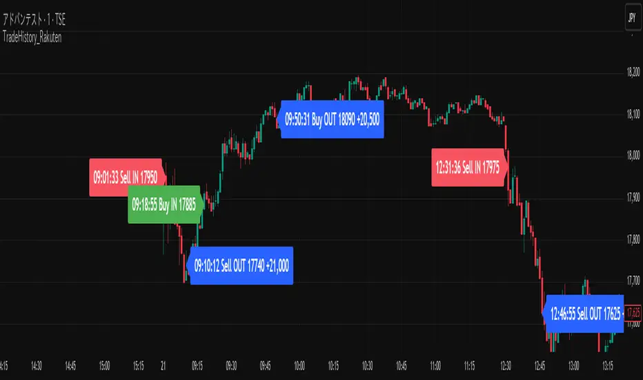
Trade History Label Display On Chart (Copy-paste from Rakuten)Overview
This script automatically displays buy/sell labels on the chart simply by copying and pasting your trade history (execution records) exported from Rakuten Securities in Excel format.
It also automatically calculates the profit and loss for each trade.
Background
When reviewing one’s trades, manually matching the broker’s execution records — “date, time, symbol, number of shares, buy or sell” — with the exact points on the chart can be extremely time-consuming.
This is especially inefficient for day traders and scalpers, who may execute dozens of trades per day.
With this script, you can automatically display the entry (IN) and exit (OUT) points on your chart as labels.
It’s also useful when attaching charts to your trading notes or journals, as you can visually confirm exactly where you entered and exited, greatly speeding up the review process.
The script also supports multiple symbols.
Even if you paste a combined dataset containing trades for several stocks, only the trades for the currently displayed symbol will appear automatically.
This allows you to maintain a single master record and instantly visualize the relevant trades just by switching charts.
How to Use
1. Preparing your Excel data
(1)Export trade history
Export your trade history as a CSV file from Rakuten Securities MarketSpeed II, etc.
If you want to include detailed execution times (seconds), make sure to export the data on the same day.
If you export later as a batch, only the date will remain — the time information (hh:mm:ss) will be lost.
(2)Open and format in Excel
Always open the CSV file in Excel — not in Notepad.
If opened in Notepad, double quotes (") will be automatically added, which makes the script unable to recognize the data correctly.
If you need to include seconds in the execution date/time, set a custom format in Excel as follows:
yyyy/mm/dd hh:mm:ss
Copy the range from Execution Date (Column A) to Execution Price (Column L).
Do not include header rows.
Copy data only. Including the header line will cause parsing errors in the script.
(3)If you create a memo column
You can add a Memo column (Column M) next to the “Execution Price” column.
Anything written here (e.g., trade reasoning or notes) will appear on the chart labels.
If you add a memo column, copy the range from Execution Date (A) to Memo (M) when pasting into the script.
Again, copy only the data (not headers). Including column names will cause errors.
2. Paste data into TradingView
Open the script settings and paste the copied data into the text area labeled “Trade Data Paste Area.”
The script automatically parses the text and recognizes date, time, symbol, trade type, position type, credit type, quantity, price, and memo, displaying them as labels at the correct bar.
You can paste data for multiple stocks at once.
Only the rows matching the currently displayed chart’s symbol will be plotted.
3. Display settings (ON/OFF controls)
Each label element (credit type, position type, quantity, memo, etc.) can be turned ON/OFF individually in the script settings via checkboxes (input.bool).
If you’ve created a memo column, its content will also appear on the label.
4. Checking on the chart
Each trade’s entry and exit are shown directly above or below the relevant candlestick.
You can switch between daily and intraday timeframes for more detailed inspection.
Labels are color-coded (e.g., Buy / Sell / Settlement) for quick visual recognition.
When switching symbols, only the relevant trade labels for that symbol will automatically appear.
5. Notes
The script is designed for use on 1-minute to daily charts.
If there’s no matching candlestick for a given trade date/time, the label may not display correctly.
Data input is manual paste only (automatic import not supported).
CSV files must be edited in Excel. Other editors may alter the text format, causing parsing errors.
Due to Pine Script limitations, input.text_area can hold a maximum of 40,960 characters.
The script is tailored for Rakuten Securities’ export format.
Using data from other brokers may require aligning column structures.
If Rakuten changes its export format, the script may need adjustment.
--------------------------------------------------------------------------------------------
概要
このスクリプトは、楽天証券の約定履歴(取引記録)をExcelからコピーして貼り付けるだけで、チャート上に売買ラベルを自動表示するツールです。
また、各取引の損益も自動で計算されます。
背景
自分のトレードを振り返る際、証券会社の約定記録から「何月何日何時何分、どの銘柄を、何株、買った・売った」を確認して、チャート上の位置と突き合わせる作業は非常に時間がかかります。
特にデイトレードやスキャルピングをしていると、1日に数十件以上の約定が発生し、手動で位置を確認するのは非効率です。
このスクリプトを使えば、IN・OUTのタイミングをチャート上にラベルとして自動表示できます。
自分のトレードノート、トレード日記にチャート画像を貼り付ける際も利用 でき、チャートのどこでエントリー/決済したかを視覚的に確認できるため、振り返り作業が大幅に効率化されます。
また、 複数銘柄に対応しており、貼り付けたデータの中から現在表示中のチャート銘柄と一致する売買履歴だけを抽出・表示します。
これにより、複数銘柄分の約定記録を一括管理していても、チャートを切り替えるだけで該当銘柄の取引履歴を瞬時に可視化できます。
使用方法
1. Excelデータの準備
(1)約定履歴のエクスポート
楽天証券マーケットスピードⅡなどから約定履歴をCSV形式でエクスポートします。
約定の詳細な時刻(時分秒単位)データを取得したい場合は、必ず当日中にエクスポートしてください。後日まとめて過去分をエクスポートしても、日付までしか記録されず、時刻情報(hh:mm:ss)は失われます。
(2)Excelで開いて整形
CSVは必ずExcelで開いて編集してください。メモ帳で開くと "(ダブルクォーテーション) が自動的に付与され、スクリプトが正しく認識できません。
約定日の秒単位までを扱いたい場合は、Excelのセル書式設定を開き、「ユーザー定義」で次の形式を新規作成して適用します。書式を変更しないでコピーした場合は分までのデータとなり、スクリプトは00秒と認識します。
yyyy/mm/dd hh:mm:ss
約定日(A列)~約定単価(L列)までのデータ部分をコピーする。
※このとき、項目名(ヘッダー行)は含めず、データ部分のみをコピーしてください。項目名を含めるとスクリプトが誤認識してエラーになります
(3)メモ欄を作成する場合
約定単価の右隣の列(M列)を「メモ欄」として利用できます。ここにエントリー根拠など任意のメモを書いておくとラベル上でもメモを確認できます。
メモ欄を作成した場合は、約定日(A列)からメモ欄(M列)までをコピーして貼り付けてください。
※このとき、項目名(ヘッダー行)は含めず、データ部分のみをコピーしてください。項目名を含めるとスクリプトが誤認識してエラーになります。
2. データをTradingViewに貼り付ける
スクリプトの設定画面を開き、「取引データ貼り付け欄」にExcelからコピーしたデータをそのまま貼り付けます。
スクリプトが自動でテキストを解析し、日付・時刻・銘柄コード・取引区分・建玉区分・信用区分・数量・単価・メモなどを認識して、ラベルをチャート上に自動配置します。
複数銘柄のデータを一度に貼り付けても問題ありません。現在表示中のチャート銘柄と一致する行だけがラベルとして描画されます。
3. 表示設定(ON/OFF切り替え)
各表示要素(信用区分・建玉区分・数量・メモなど)は、設定画面のチェックボックス(input.bool)で個別に表示/非表示を切り替えられます。
メモ欄を作成している場合は、その内容もラベルに表示されます。
4. チャートでの確認
各取引のIN・OUTが、チャート上の該当バー(ローソク足)にラベルとして表示されます。
日足・分足を切り替えることで、より詳細なタイミングを確認できます。
ラベルは、買い(Buy)・売り(Sell)・返済などで色分けされ、視覚的に理解しやすい構成になっています。
チャートを銘柄ごとに切り替えるだけで、その銘柄の取引履歴のみが自動表示されます。
5. 注意点
このスクリプトは 1分足~日足 での使用を想定しています。データ上の日付や時刻に対応するローソク足が存在しない場合、ラベルを正しく表示できません。
データは手動貼り付け方式です。自動取得には対応していません。
Excel以外のアプリで開いたCSVは、文字列形式が変わるため解析できないことがあります。
Pineスクリプトの仕様上、テキストエリアには40,960文字までしか貼り付けできません。
楽天証券の出力フォーマットを想定しているため、他社形式を使う場合は列構成を揃える必要があります。
また、楽天証券の出力フォーマットが変更された場合は、正しく表示出来なります。
LEGEND IsoPulse Fusion Universal Volume Trend Buy Sell RadarLEGEND IsoPulse Fusion • Universal Volume Trend Buy Sell Radar
One line summary
LEGEND IsoPulse Fusion reads intent from price and volume together, learns which features matter most on your symbol, blends them into a single signed Fusion line in a stable unit range, and emits clear Buy Sell Close events with a structure gate and a liquidity safety gate so you act only when the tape is favorable.
What this script is and why it exists
Many traders keep separate windows for trend, volume, volatility, and regime filters. The result can feel fragmented. This script merges two complementary engines into one consistent view that is easy to read and simple to act on.
LEGEND Tensor estimates directional quality from five causally computed features that are normalized for stationarity. The features are Flow, Tail Pressure with Volume Mix, Path Curvature, Streak Persistence, and Entropy Order.
IsoPulse transforms raw volume into two decaying reservoirs for buy effort and sell effort using body location and wick geometry, then measures price travel per unit volume for efficiency, and detects volume bursts with a recency memory.
Both engines are mapped into the same unit range and fused by a regime aware mixer. When the tape is orderly the mixer leans toward trend features. When the tape is messy but a true push appears in volume efficiency with bursts the mixer allows IsoPulse to speak louder. The outcome is a single Fusion line that lives in a familiar range with calm behavior in quiet periods and expressive pushes when energy concentrates.
What makes it original and useful
Two reservoir volume split . The script assigns a portion of the bar volume to up effort and down effort using body location and wick geometry together. Effort decays through time using a forgetting factor so memory is present without becoming sticky.
Efficiency of move . Price travel per unit volume is often more informative than raw volume or raw range. The script normalizes both sides and centers the efficiency so it becomes signed fuel when multiplied by flow skew.
Burst detection with recency memory . Percent rank of volume highlights bursts. An exponential memory of how recently bursts clustered converts isolated blips into useful context.
Causal adaptive weighting . The LEGEND features do not receive static weights. The script learns, causally, which features have correlated with future returns on your symbol over a rolling window. Only positive contributions are allowed and weights are normalized for interpretability.
Regime aware fusion . Entropy based order and persistence create a mixer that blends IsoPulse with LEGEND. You see a single line rather than two competing panels, which reduces decision conflict.
How to read the screen in seconds
Fusion area . The pane fills above and below zero with a soft gradient. Deeper fill means stronger conviction. The white Fusion line sits on top for precise crossings.
Entry guides and exit guides . Two entry guides draw symmetrically at the active fused entry level. Two exit guides sit inside at a fraction of the entry. Think of them as an adaptive envelope.
Letters . B prints once when the script flips from flat to long. S prints once when the script flips from flat to short. C prints when a held position ends on the appropriate side. T prints when the structure gate first opens. A prints when the liquidity safety flag first appears.
Price bar paint . Bars tint green while long and red while short on the chart to mirror your virtual position.
HUD . A compact dashboard in the corner shows Fusion, IsoPulse, LEGEND, active entry and exit levels, regime status, current virtual position, and the vacuum z value with its avoid threshold.
What signals actually mean
Buy . A Buy prints when the Fusion line crosses above the active entry level while gates are open and the previous state was flat.
Sell . A Sell prints when the Fusion line crosses below the negative entry level while gates are open and the previous state was flat.
Close . A Close prints when Fusion cools back inside the exit envelope or when an opposite cross would occur or when a gate forces a stop, and the previous state was a hold.
Gates . The Trend gate requires sufficient entropy order or significant persistence. The Avoid gate uses a liquidity vacuum z score. Gates exist to protect you from weak tape and poor liquidity.
Inputs and practical tuning
Every input has a tooltip in the script. This section provides a concise reference that you can keep in mind while you work.
Setup
Core window . Controls statistics across features. Scalping often prefers the thirties or low fifties. Intraday often prefers the fifties to eighties. Swing often prefers the eighties to low hundreds. Smaller responds faster with more noise. Larger is calmer.
Smoothing . Short EMA on noisy features. A small value catches micro shifts. A larger value reduces whipsaw.
Fusion and thresholds
Weight lookback . Sample size for weight learning. Use at least five times the horizon. Larger is slower and more confident. Smaller is nimble and more reactive.
Weight horizon . How far ahead return is measured to assess feature value. Smaller favors quick reversion impulses. Larger favors continuation.
Adaptive thresholds . Entry and exit levels from rolling percentiles of the absolute LEGEND score. This self scales across assets and timeframes.
Entry percentile . Eighty selects the top quintile of pushes. Lower to seventy five for more signals. Raise for cleanliness.
Exit percentile . Mid fifties keeps trades honest without overstaying. Sixty holds longer with wider give back.
Order threshold . Minimum structure to trade. Zero point fifteen is a reasonable start. Lower to trade more. Raise to filter chop.
Avoid if Vac z . Liquidity safety level. One point two five is a good default on liquid markets. Thin markets may prefer a slightly higher setting to avoid permanent avoid mode.
IsoPulse
Iso forgetting per bar . Memory for the two reservoirs. Values near zero point nine eight to zero point nine nine five work across many symbols.
Wick weight in effort split . Balance between body location and wick geometry. Values near zero point three to zero point six capture useful behavior.
Efficiency window . Travel per volume window. Lower for snappy symbols. Higher for stability.
Burst percent rank window . Window for percent rank of volume. Around one hundred to three hundred covers most use cases.
Burst recency half life . How long burst clusters matter. Lower for quick fades. Higher for cluster memory.
IsoPulse gain . Pre compression gain before the atan mapping. Tune until the Fusion line lives inside a calm band most of the time with expressive spikes on true pushes.
Continuation and Reversal guides . Visual rails for IsoPulse that help you sense continuation or exhaustion zones. They do not force events.
Entry sensitivity and exit fraction
Entry sensitivity . Loose multiplies the fused entry level by a smaller factor which prints more trades. Strict multiplies by a larger factor which selects fewer and cleaner trades. Balanced is neutral.
Exit fraction . Exit level relative to the entry level in fused unit space. Values around one half to two thirds fit most symbols.
Visuals and UX
Columns and line . Use both to see context and precise crossings. If you present a very clean chart you can turn columns off and keep the line.
HUD . Keep it on while you learn the script. It teaches you how the gates and thresholds respond to your market.
Letters . B S C T A are informative and compact. For screenshots you can toggle them off.
Debug triggers . Show raw crosses even when gates block entries. This is useful when you tune the gates. Turn them off for normal use.
Quick start recipes
Scalping one to five minutes
Core window in the thirties to low fifties.
Horizon around five to eight.
Entry percentile around seventy five.
Exit fraction around zero point five five.
Order threshold around zero point one zero.
Avoid level around one point three zero.
Tune IsoPulse gain until normal Fusion sits inside a calm band and true squeezes push outside.
Intraday five to thirty minutes
Core window around fifty to eighty.
Horizon around ten to twelve.
Entry percentile around eighty.
Exit fraction around zero point five five to zero point six zero.
Order threshold around zero point one five.
Avoid level around one point two five.
Swing one hour to daily
Core window around eighty to one hundred twenty.
Horizon around twelve to twenty.
Entry percentile around eighty to eighty five.
Exit fraction around zero point six zero to zero point seven zero.
Order threshold around zero point two zero.
Avoid level around one point two zero.
How to connect signals to your risk plan
This is an indicator. You remain in control of orders and risk.
Stops . A simple choice is an ATR multiple measured on your chart timeframe. Intraday often prefers one point two five to one point five ATR. Swing often prefers one point five to two ATR. Adjust to symbol behavior and personal risk tolerance.
Exits . The script already prints a Close when Fusion cools inside the exit envelope. If you prefer targets you can mirror the entry envelope distance and convert that to points or percent in your own plan.
Position size . Fixed fractional or fixed risk per trade remains a sound baseline. One percent or less per trade is a common starting point for testing.
Sessions and news . Even with self scaling, some traders prefer to skip the first minutes after an open or scheduled news. Gate with your own session logic if needed.
Limitations and honest notes
No look ahead . The script is causal. The adaptive learner uses a shifted correlation, crosses are evaluated without peeking into the future, and no lookahead security calls are used. If you enable intrabar calculations a letter may appear then disappear before the close if the condition fails. This is normal for any cross based logic in real time.
No performance promises . Markets change. This is a decision aid, not a prediction machine. It will not win every sequence and it cannot guarantee statistical outcomes.
No dependence on other indicators . The chart should remain clean. You can add personal tools in private use but publications should keep the example chart readable.
Standard candles only for public signals . Non standard chart types can change event timing and produce unrealistic sequences. Use regular candles for demonstrations and publications.
Internal logic walkthrough
LEGEND feature block
Flow . Current return normalized by ATR then smoothed by a short EMA. This gives directional intent scaled to recent volatility.
Tail pressure with volume mix . The relative sizes of upper and lower wicks inside the high to low range produce a tail asymmetry. A volume based mix can emphasize wick information when volume is meaningful.
Path curvature . Second difference of close normalized by ATR and smoothed. This captures changes in impulse shape that can precede pushes or fades.
Streak persistence . Up and down close streaks are counted and netted. The result is normalized for the window length to keep behavior stable across symbols.
Entropy order . Shannon entropy of the probability of an up close. Lower entropy means more order. The value is oriented by Flow to preserve sign.
Causal weights . Each feature becomes a z score. A shifted correlation against future returns over the horizon produces a positive weight per feature. Weights are normalized so they sum to one for clarity. The result is angle mapped into a compact unit.
IsoPulse block
Effort split . The script estimates up effort and down effort per bar using both body location and wick geometry. Effort is integrated through time into two reservoirs using a forgetting factor.
Skew . The reservoir difference over the sum yields a stable skew in a known range. A short EMA smooths it.
Efficiency . Move size divided by average volume produces travel per unit volume. Normalization and centering around zero produce a symmetric measure.
Bursts and recency . Percent rank of volume highlights bursts. An exponential function of bars since last burst adds the notion of cluster memory.
IsoPulse unit . Skew multiplied by centered efficiency then scaled by the burst factor produces the raw IsoPulse that is angle mapped into the unit range.
Fusion and events
Regime factor . Entropy order and streak persistence form a mixer. Low structure favors IsoPulse. Higher structure favors LEGEND. The blend is convex so it remains interpretable.
Blended guides . Entry and exit guides are blended in the same way as the line so they stay consistent when regimes change. The envelope does not jump unexpectedly.
Virtual position . The script maintains state. Buy and Sell require a cross while flat and gates open. Close requires an exit or force condition while holding. Letters print once at the state change.
Disclosures
This script and description are educational. They do not constitute investment advice. Markets involve risk. You are responsible for your own decisions and for compliance with local rules. The logic is causal and does not look ahead. Signals on non standard chart types can be misleading and are not recommended for publication. When you test a strategy wrapper, use realistic commission and slippage, moderate risk per trade, and enough trades to form a meaningful sample, then document those assumptions if you share results.
Closing thoughts
Clarity builds confidence. The Fusion line gives a single view of intent. The letters communicate action without clutter. The HUD confirms context at a glance. The gates protect you from weak tape and poor liquidity. Tune it to your instrument, observe it across regimes, and use it as a consistent lens rather than a prediction oracle. The goal is not to trade every wiggle. The goal is to pick your spots with a calm process and to stand aside when the tape is not inviting.

TextLibrary "Text"
library to format text in different fonts or cases plus a sort function.
🔸 Credits and Usage
This library is inspired by the work of three authors (in chronological order of publication date):
Unicode font function - JD - Duyck
UnicodeReplacementFunction - wlhm
font - kaigouthro
🔹 Fonts
Besides extra added font options, the toFont(fromText, font) method uses a different technique. On the first runtime bar (whether it is barstate.isfirst , barstate.islast , or between) regular letters and numbers and mapped with the chosen font. After this, each character is replaced using the build-in key - value pair map function .
Also an enum Efont is included.
Note: Some fonts are not complete, for example there isn't a replacement for every character in Superscript/Subscript.
Example of usage (besides the included table example):
import fikira/Text/1 as t
i_font = input.enum(t.Efont.Blocks)
if barstate.islast
sentence = "this sentence contains words"
label.new(bar_index, 0, t.toFont(fromText = sentence, font = str.tostring(i_font)), style=label.style_label_lower_right)
label.new(bar_index, 0, t.toFont(fromText = sentence, font = "Circled" ), style=label.style_label_lower_left )
label.new(bar_index, 0, t.toFont(fromText = sentence, font = "Wiggly" ), style=label.style_label_upper_right)
label.new(bar_index, 0, t.toFont(fromText = sentence, font = "Upside Latin" ), style=label.style_label_upper_left )
🔹 Cases
The script includes a toCase(fromText, case) method to transform text into snake_case, UPPER SNAKE_CASE, kebab-case, camelCase or PascalCase, as well as an enum Ecase .
Example of usage (besides the included table example):
import fikira/Text/1 as t
i_case = input.enum(t.Ecase.camel)
if barstate.islast
sentence = "this sentence contains words"
label.new(bar_index, 0, t.toCase(fromText = sentence, case = str.tostring(i_case)), style=label.style_label_lower_right)
label.new(bar_index, 0, t.toCase(fromText = sentence, case = "snake_case" ), style=label.style_label_lower_left )
label.new(bar_index, 0, t.toCase(fromText = sentence, case = "PascalCase" ), style=label.style_label_upper_right)
label.new(bar_index, 0, t.toCase(fromText = sentence, case = "SNAKE_CASE" ), style=label.style_label_upper_left )
🔹 Sort
The sort(strings, order, sortByUnicodeDecimalNumbers) method returns a sorted array of strings.
strings: array of strings, for example words = array.from("Aword", "beyond", "Space", "salt", "pepper", "swing", "someThing", "otherThing", "12345", "_firstWord")
order: "asc" / "desc" (ascending / descending)
sortByUnicodeDecimalNumbers: true/false; default = false
_____
• sortByUnicodeDecimalNumbers: every Unicode character is linked to a Unicode Decimal number ( wikipedia.org/wiki/List_of_Unicode_characters ), for example:
1 49
2 50
3 51
...
A 65
B 66
...
S 83
...
_ 95
` 96
a 97
b 98
...
o 111
p 112
q 113
r 114
s 115
...
This means, if we sort without adjusting ( sortByUnicodeDecimalNumbers = true ), in ascending order, the letter b (98 - small) would be after S (83 - Capital).
By disabling sortByUnicodeDecimalNumbers , Capital letters are intermediate transformed to str.lower() after which the Unicode Decimal number is retrieved from the small number instead of the capital number. For example S (83) -> s (115), after which the number 115 is used to sort instead of 83.
Example of usage (besides the included table example):
import fikira/Text/1 as t
if barstate.islast
aWords = array.from("Aword", "beyond", "Space", "salt", "pepper", "swing", "someThing", "otherThing", "12345", "_firstWord")
label.new(bar_index, 0, str.tostring(t.sort(strings= aWords, order = 'asc' , sortByUnicodeDecimalNumbers = false)), style=label.style_label_lower_right)
label.new(bar_index, 0, str.tostring(t.sort(strings= aWords, order = 'desc', sortByUnicodeDecimalNumbers = false)), style=label.style_label_lower_left )
label.new(bar_index, 0, str.tostring(t.sort(strings= aWords, order = 'asc' , sortByUnicodeDecimalNumbers = true )), style=label.style_label_upper_right)
label.new(bar_index, 0, str.tostring(t.sort(strings= aWords, order = 'desc', sortByUnicodeDecimalNumbers = true )), style=label.style_label_upper_left )
🔸 Methods/functions
method toFont(fromText, font)
toFont : Transforms text into the selected font
Namespace types: series string, simple string, input string, const string
Parameters:
fromText (string)
font (string)
Returns: `fromText` transformed to desired `font`
method toCase(fromText, case)
toCase : formats text to snake_case, UPPER SNAKE_CASE, kebab-case, camelCase or PascalCase
Namespace types: series string, simple string, input string, const string
Parameters:
fromText (string)
case (string)
Returns: `fromText` formatted to desired `case`
method sort(strings, order, sortByUnicodeDecimalNumbers)
sort : sorts an array of strings, ascending/descending and by Unicode Decimal numbers or not.
Namespace types: array
Parameters:
strings (array)
order (string)
sortByUnicodeDecimalNumbers (bool)
Returns: Sorted array of strings

Candle Partition Statistics with IQV and Chi2NOTE: THE FORMULA IN THE CHART IS NOT PART OF THE CODE
This Pine Script calculates statistical measures for candle partitions based on whether a candle is bullish or bearish and whether the price is above or below an EMA. It evaluates statistical properties such as the Index of Qualitative Variation (IQV) and the Chi-Square (χ²) statistic to assess variations in price action.
Concept of Index of Qualitative Variation (IQV)
IQV is a statistical measure used to quantify the diversity or dispersion of categorical variables. In this script, it is used to measure how evenly the four categories of candles (green above EMA, red above EMA, green below EMA, red below EMA) are distributed.
Purpose of IQV in the Script:
IQV ranges from 0 to 1, where 0 indicates no variation (one category dominates) and 1 indicates maximum variation (categories are equally distributed).
A high IQV suggests balanced distributions of bullish/bearish candles above/below the EMA, indicating market uncertainty or mixed sentiment.
A low IQV suggests dominance of a particular candle type, indicating a strong trend.
Concept of Chi-Square (χ²) Test
Chi-square (χ²) is a statistical test that measures the difference between expected and observed frequencies of categorical data. It assesses whether short-term price behavior significantly deviates from historical trends.
Purpose of Chi-Square in the Script:
A high χ² value means that short-term candle distributions are significantly different from historical patterns, indicating potential trend shifts.
If χ² exceeds a predefined significance threshold (chi_threshold), an alert (Chi² Alert!) is triggered.
It helps traders identify periods where recent price behavior deviates from historical norms, possibly signaling trend reversals or market regime changes.
Key Takeaways:
IQV helps measure the diversity of price action, detecting whether the market is balanced or trending.
Chi-square (χ²) identifies significant deviations in short-term price behavior compared to long-term trends.
Both metrics together provide insights into whether the market is stable, trending, or shifting.
The Nasan C-score enhances trend strength by incorporating volatility. It is calculated as:
enhanced_t_s =(𝑡𝑠 × avg_movement x 100)/SMA(𝑐lose)
Key Components:
𝑡𝑠 : Measures trend strength based on price movements relative to EMA.
ts=green_EMAup_a+0.5×red_EMAup_a−(0.5×green_EMAdown_a+red_EMAdown_a)
avg_movement: The SMA of absolute close-open differences, capturing volatility.
Normalization: The division by SMA(close) adjusts the score relative to price levels.
Purpose of the Nasan C-score
Enhanced Trend Strength
It amplifies the trend strength value by factoring in volatility (price movement).
If price volatility is high, trend strength variations have a greater impact.
Volatility-Adjusted Momentum
By scaling 𝑡𝑠 with average movement, the score adjusts to changing price dynamics.
Higher price fluctuations lead to a higher score, making trend shifts more prominent.
How It Can Be Used in Trading
Higher values of Nasan C-score indicate strong bullish or bearish trends.
Comparing it with past values helps determine whether momentum is increasing or fading.
Thresholds can be set to identify significant trend shifts based on historical highs and lows.

Buy&Sell Hollow CandlesThe Hollow Candles Script is a type of candlestick analysis script designed to highlight the following:
Purpose of the Script: This script provides the user with buy and sell signals based on candlesticks that show an upward or downward reversal.
Mechanism of the Script: When a hollow (unfilled) red candle appears, it signals a potential entry, provided that this candle is at a low point, following a series of red candles with higher volume than previous days. Similarly, it gives a sell signal when a green candle appears at a peak with high sell volume surpassing that of prior days. However, the appearance of these candles alone should not prompt an immediate buy or sell; you should wait for a confirming candle to validate the signal.
Sideways Movement Caution: If these signals appear during a sideways or flat trend, it is not advisable to proceed with buying or selling.
Chart Insights: The chart demonstrates certain buy and sell operations along with some non-ideal signals where decision-making should be based on fundamental analytical experience.

ET's FlagsPurpose:
This Pine Script is designed for the TradingView platform to identify and visually highlight specific technical chart patterns known as "Bull Flags" and "Bear Flags" on financial charts. These patterns are significant in trading as they can indicate potential continuation trends after a brief consolidation. The script includes mechanisms to manage signal frequency through a cooldown period, ensuring that the trading signals are not excessively frequent and are easier to interpret.
Functionality:
Input Parameters:
flagpole_length: Defines the number of bars to consider when identifying the initial surge in price, known as the flagpole.
flag_length: Determines the number of bars over which the flag itself is identified, representing a period of consolidation.
percent_change: Sets the minimum percentage change required to validate the presence of a flagpole.
cooldown_period: Specifies the number of bars to wait before another flag can be identified, reducing the risk of overlapping signals.
Percentage Change Calculation:
The script calculates the percentage change between two price points using a helper function percentChange(start, end). This function is crucial for determining whether the price movement within the specified flagpole_length meets the threshold set by percent_change, thus qualifying as a potential flagpole.
Flagpole Identification:
Bull Flagpole: Identified by finding the lowest close price over the flagpole_length and determining if the subsequent price rise meets or exceeds the specified percent_change.
Bear Flagpole: Identified by finding the highest close price over the flagpole_length and checking if the subsequent price drop is sufficient as per the percent_change.
Flag Identification:
After identifying a flagpole, the script assesses if the price action within the next flag_length bars consolidates in a manner that fits a flag pattern. This involves checking if the price fluctuation stays within the bounds set by the percent_change.
Signal Plotting:
If a bull or bear flag pattern is confirmed, and the cooldown period has passed since the last flag of the same type was identified, the script plots a visual shape on the chart:
Green shapes below the price bar for Bull Flags.
Red shapes above the price bar for Bear Flags.
Line Drawing:
For enhanced visualization, the script draws lines at the high and low prices of the flag during its formation period. This visually represents the consolidation phase of the flag pattern.
Debugging Labels:
The script optionally displays labels at the flag formation points, showing the exact percentage change achieved during the flagpole formation. This feature aids users in understanding why a particular segment of the price chart was identified as a flag.
Compliance and Usage:
This script does not automate trading but provides visual aids and potential signals based on historical price analysis. It adheres to TradingView's scripting policies by only accessing publicly available price data and user-defined parameters without executing trades or accessing any external data.
Conclusion:
This Pine Script is a powerful tool for traders who follow technical analysis, offering a clear, automated way to spot potential continuation patterns in the markets they monitor. By emphasizing visual clarity and reducing signal redundancy through cooldown periods, the script enhances decision-making processes for chart analysis on TradingView.
Liquidations Meter [LuxAlgo]The Liquidation Meter aims to gauge the momentum of the bar, identify the strength of the bulls and bears, and more importantly identify probable exhaustion/reversals by measuring probable liquidations.
🔶 USAGE
This tool includes many features related to the concept of liquidation. The two core ones are the liquidation meter and liquidation price calculator, highlighted below.
🔹 Liquidation Meter
The liquidation meter presents liquidations on the price chart by measuring the highest leverage value of longs and shorts that have been potentially liquidated on the last chart bar, hence allowing traders to:
gauge the momentum of the bar.
identify the strength of the bulls and bears.
identify probable reversal/exhaustion points.
Liquidation of low-leveraged positions can be indicative of exhaustion.
🔹 Liquidation Price Calculator
A liquidation price calculator might come in handy when you need to calculate at what price level your leveraged position in Crypto, Forex, Stocks, or any other asset class gets liquidated to add a protective stop to mitigate risk. Monitoring an open position gets easier if the trader can calculate the total risk in order for them to choose the right amount of margin and leverage.
Liquidation price is the distance from the trader's entry price to the price where trader's leveraged position gets liquidated due to a loss. As the leverage is increased, the distance from trader's entry price to the liquidation price shrinks.
While you have one or several trades open you can quickly check their liquidation levels and determine which one of the trades is closest to their liquidation price.
If you are a day trader that uses leverage and you want to know which trade has the best outlook you can calculate the liquidation price to see which one of the trades looks best.
🔹 Dashboard
The bar statistics option enables measuring and presenting trading activity, volatility, and probable liquidations for the last chart bar.
🔶 DETAILS
It's important to note that liquidation price calculator tool uses a formula to calculate the liquidation price based on the entry price + leverage ratio.
Other factors such as leveraged fees, position size, and other interest payments have been excluded since they are variables that don’t directly affect the level of liquidation of a leveraged position.
The calculator also assumes that traders are using an isolated margin for one single position and does not take into consideration the additional margin they might have in their account.
🔹Liquidation price formula
the liquidation distance in percentage = 100 / leverage ratio
the liquidation distance in price = current asset price x the liquidation distance in percentage
the liquidation price (longs) = current asset price – the liquidation distance in price
the liquidation price (shorts) = current asset price + the liquidation distance in price
or simply
the liquidation price (longs) = entry price * (1 – 1 / leverage ratio)
the liquidation price (shorts) = entry price * (1 + 1 / leverage ratio)
Example:
Let’s say that you are trading a leverage ratio of 1:20. The first step is to calculate the distance to your liquidation point in percentage.
the liquidation distance in percentage = 100 / 20 = 5%
Now you know that your liquidation price is 5% away from your entry price. Let's calculate 5% below and above the entry price of the asset you are currently trading. As an example, we assume that you are trading bitcoin which is currently priced at $35000.
the liquidation distance in price = $35000 x 0.05 = $1750
Finally, calculate liquidation prices.
the liquidation price (longs) = $35000 – $1750 = $33250
the liquidation price (short) = $35000 + $1750 = $36750
In this example, short liquidation price is $36750 and long liquidation price is $33250.
🔹How leverage ratio affects the liquidation price
The entry price is the starting point of the calculation and it is from here that the liquidation price is calculated, where the leverage ratio has a direct impact on the liquidation price since the more you borrow the less “wiggle-room” your trade has.
An increase in leverage will subsequently reduce the distance to full liquidation. On the contrary, choosing a lower leverage ratio will give the position more room to move on.
🔶 SETTINGS
🔹Liquidations Meter
Base Price: The option where to set the reference/base price.
🔹Liquidation Price Calculator
Liquidation Price Calculator: Toggles the visibility of the calculator. Details and assumptions made during the calculations are stated in the tooltip of the option.
Entry Price: The option where to set the entry price, a value of 0 will use the current closing price. Details are given in the tooltip of the option.
Leverage: The option where to set the leverage value.
Show Calculated Liquidation Prices on the Chart: Toggles the visibility of the liquidation prices on the price chart.
🔹Dashboard
Show Bar Statistics: Toggles the visibility of the last bar statistics.
🔹Others
Liquidations Meter Text Size: Liquidations Meter text size.
Liquidations Meter Offset: Liquidations Meter offset.
Dashboard/Calculator Placement: Dashboard/calculator position on the chart.
Dashboard/Calculator Text Size: Dashboard text size.
🔶 RELATED SCRIPTS
Here are some of the scripts that are related to the liquidation and liquidity concept, for more and other conceptual scripts you are kindly invited to visit LuxAlgo-Scripts .
Liquidation-Levels
Liquidations-Real-Time
Buyside-Sellside-Liquidity

[blackcat] L1 T3 MA Lite Version
Tilson T3 Moving Average (T3MA) is a type of moving average line designed to reduce lag and improve the accuracy of trend identification. It is based on a combination of multiple smoothed moving averages, with each subsequent smoothed moving average having a higher weight than the previous one. The T3MA formula includes three different smoothing coefficients and a volume coefficient or volatility coefficient, which can be adjusted according to user preferences. T3MA is commonly used by traders and investors to identify trends and generate trading signals.
The calculation method for T3MA requires the use of exponential moving averages (EMA). In Pine scripts in the TradingView community, over 90% of them use the EMA function to calculate T3MA. Specifically, in Pine scripts, it is necessary to define the length and volatility coefficient of T3MA, then calculate three different lengths of EMA separately. Next, three constants need to be calculated that are related to volatility. Finally, the weighted average value of the three EMAs and three constants is added together to obtain the value of T3MA. If you want to customize the length and volatility of T3MA, you just need to modify the parameters in the code. Overall, T3MA is a very useful technical indicator that can help traders better understand market trends and improve trading efficiency.
The improved version introduced today mainly addresses my perception that traditional T3 algorithms are too redundant with high computational complexity leading to delayed reactions. Therefore, I have developed a lightweight version called L1 T3 MA Lite Version. This doesn't bring about any qualitative changes; it simply makes adjustments in terms of computational resources and response speed. To illustrate its advantages compared with traditional T3 MA indicators, I will provide a comparison using Everget's script from TradingView community blogger everget.
The difference between these two scripts for calculating T3 Moving Average lies in their implementation methods. The first script (Everget) uses a more complex calculation formula, which requires calculating three different lengths of EMA and computing three constants based on volatility. Finally, they are weighted averaged to obtain T3MA. This complex calculation formula can enhance the sensitivity of the T3MA indicator, thereby better identifying price trends. On the other hand, the second script (Blackcat1402) uses a relatively simple calculation formula that only requires calculating three different lengths of EMA and computing three constants based on volatility. Finally, they are weighted averaged to obtain T3MA as well. This simple calculation formula reduces computational complexity and speeds up calculations. Both have slightly different effects and calculation methods; users can choose the script that suits their needs.
In summary, T3 Moving Average is a very useful technical indicator that can help traders better understand market trends and improve trading efficiency. Users can choose scripts suitable for themselves according to their needs and flexibly adjust the length and volatility coefficient of T3MA to adapt to different markets.
Strategy:Reversal-CatcherWhat
This is a plain and vanilla reversal based strategy for intraday (15m) timeframe on Futures prices of the assets.
Now what all it comprises of?
It finds out the dynamic support & resistance from Bollinger Band (20 period, 1.5 std dev).
It finds out the potential divergence of price deviation from 5 period exponential moving average (EMA).
If the previous candle (N-1) shows a divergence it confirms the reversal by checking the present candle (N) to be closed inside the Bollinger Band.
It confirms the momentum by checking RSI shows a crossover/crossunder to oversold (30) / overbought (70) region.
It also confirms whether the trend is up (then only reversal trade to short) or down (then only reversal trade to long). The trend is checked with EMA-21 and EMA-50.
Re-affirmation Condition : It re-affirms the position of two successive candles called as `hhLLong` and `hhLLShort` in the script.
Why
In Indian context, retail participants are pre-dominantly (yes- 80% of Indian daily volume) Options buyers mainly in weekly indices (Nifty, BankNifty, FinNifty, CNXMidcap, Sensex, Bankx .. well everyday is expiry now in India, except -- Thank God -- Saturday & Sunday).
And in Index Options the momentum plays a big role.
If one can catch a good reversal point the potential of high Risk-to-Reward trade (hence earn handsomely) is very likely (please note: there is no holy grail in trading. Nothing works 100%).
So this is the attempt to catch a reversal.
Re-affirmation of Reversal
hhLLong : It's a reversal point after an uptrend. It checks the relative positioning of current candle compared to that of previous candle. [The details are in the script. Check for variable hhLLong in script.
hhLLShort : It's a reversal point after a downtrend. It checks the relative positioning of current candle compared to that of previous candle. [The details are in the script. Check for variable hhLLShort in script.
Unique-ness
What's unique in it? Why we decided to publicly share this:
Already given the context of The Great Indian Options Buyers community. It should be helpful to them, we believe.
It takes Very Less Number of Trades with High Accuracy . Please check the result in NSE:NIFTY1! in 15m timeframe. 71% accuracy with roughly a trade in a month.
There is no point giving brokers' the brokerages taking 10 trades a day and ending not-so-good EoD. Better lets take less trades with better result possibility. .
Mention
There are many people uses this variation of Bolling Band, 5EMA
Many people use RSI, trends and relative positioning of candles.
--> We are grateful to all of them. It's really difficult to mention everyone's name. But all people somehow influence the thought process. Thanks for all of them.
Statutory Disclaimer
There is no silver bullet / holy grail in trading. Nothing works 100% time. One has to be careful about the loss (s)he can bear in case of the trade goes against.
We, as the author of this script, is not responsible for any trading or position decision one is taken based on the outcome of this.
It is our sole discretion to change, add, delete the portion or withdraw the whole script without any prior notice or intimation.
In Indian Context : We are not SEBI registered, will never be SEBI registered.
BUY/SELL + ADVANCE DECLINEThis script is a custom trading view indicator that helps to identify potential buy and sell signals based on the RSI (Relative Strength Index) and SMA (Simple Moving Average) indicators. The script also identifies potential reversals using a combination of RSI and price action. It plots buy, sell, and reversal signals on the chart along with an SMA line. Additionally, it provides alerts based on the buy, sell, and reversal conditions.
Changes made to the original script:
Fixed the undeclared identifier 'c' error by calculating the difference between the current closing price and the previous closing price: c = close - close .
Added an "ADD Value Floating Label" to the chart. The label shows the difference between the current and previous closing prices (ADD value) along with a "Bullish" or "Bearish" indicator based on the value of 'c'. The label is positioned at the top right of the visible chart area and remains static.
Here's a summary of the major components of the script:
Input settings: Define the input parameters for RSI and SMA.
Calculation of RSI and SMA: Compute the RSI and SMA values based on the input parameters.
Color definitions: Define colors for different conditions and levels.
Condition definitions: Define various conditions for buy, sell, reversal, and other criteria.
Buy and sell conditions: Determine buy and sell signals based on RSI, SMA, and price action.
Reversal conditions: Identify potential reversals using RSI and price action.
Plot signals: Display buy, sell, and reversal signals on the chart.
Bar colors: Color the bars based on the identified signals.
Plot SMA: Display the SMA line on the chart.
Alert conditions: Set up alerts for buy, sell, and reversal conditions.
ADD Value Floating Label: Add a label to the chart showing the ADD value and a "Bullish" or "Bearish" indicator.

New Bearish Downtrend Script - Perfect for Short SellingIts been a while since i last uploaded a script, what i have for you today is a script which works very efficiently for downtrends and spotting reversals. This is a script i use on a weekly basis when looking to short sell.
This script includes :
Updated** Rally Candles for HTF and LTF ( End of Impulsive move signal) - The psychology of the candle when used with market information can be viewed as a end or near to the end of a big impulsive leg - when this candle occurs in BEARISH CONDITIONS, we can assume price is likely to move away short term.
Major and Minor Support Levels HTF (Areas of interest)
The Psychology on these levels is price will do something at these key levels - it takes in the last quarter price action of High Open Low Close to generate the price levels and when price comes into these areas we are likely to see a bounce or rejection from this area.
Bearish Breakout Volume Candle - This candle will paint a Purple colour bar when volume breaks above the 7day average - this shows strong momentum in the market and will usually be seen when price is in a downtrend with strong momentum.. However when this does occur we can expect a short term bounce or base so don't trade the volume bar alone.
Indecision Candles - Psychology of this candle is to show exhaustion in the trend and ideally what to see this candle appear with Rally Candles at key areas for stronger set up. When the trend is moving up, the bearish doji can appear - i tend to look at this situation as a pause in the trend.
200 EMA
Everything in this script has alert conditions to provide an edge in the markets
This is an example of how the script will look on the HTF I'm using the Daily Timeframe for reference on TSLA
This is an example of how the script looks like on the LTF, price hit the Major Resistance twice and failed to hit the 3rd time and on each leg of the impulse, the chart portrayed the LTF Rally Candles
Heres an example on how to use both Major Resistance ( Area of Interest) Rally Candle and Volume Breakout as a trade set up idea - This setup idea was on Crude Oil last week and into this week.
When added to confluences such as Supply Zones, Mitigation Levels, Quasimodo patterns etc... this will enhance the script.
I will answer any questions if i haven't made the script clear or take any requests to improve the script.
Also will be uploading the Bullish Uptrend Script soon.